Roblox's Old Hidden Images
2024-12-11
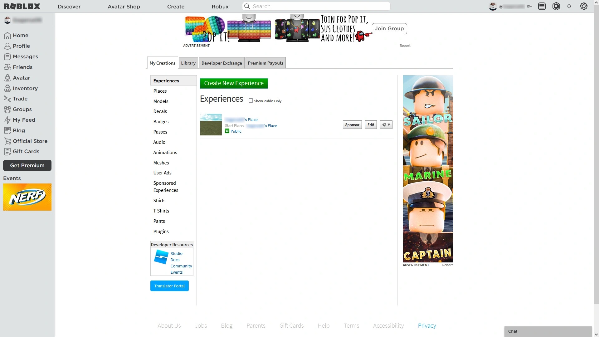
For how popular Roblox as a platform is, you may sometimes forget how stitched together the website is. A great example of this: for those of you who have been on this website for a while, you'll likely remember the insane discrepancy between the design of the main website & the "Develop" tab.
 This page shares a design language with the pre-2015 website. It also didn't support dark mode!
Today, things seem to have marginally improved. The "Develop" tab (called "Create") doesn't blast your eyes with nostalgia from the 2010s (and the lack of dark mode), but it still doesn't seem to be consistent with the rest of the website.
Some cool things I found
While examining Roblox.com's code for fun, I noticed the unique way they display icons.


Each icon on the left image is taken from the big spritesheet on the right. The full image is loaded into every single icon slot and is "cropped" to only fit an icon, after which it's moved using the background-position CSS property.
Ever wondered how the Limited or Unique tags got added to items on the catalog? You may think they are separate images, but nope! They are also part of a big SVG spritesheet.
This image still has some of the old tags that Roblox used to use, like the "BC", "TBC" or "OBC" tags, as well as "13+" items... Remember those?
These sorts of spritesheets were primarily used to technical limitations back in the day of HTTP/1.1, which limited the number of simultaneous connections a browser could make to a server. By combining multiple images into a spritesheet, they could reduce the number of HTTP requests needed to load a page. What surprises me the most is that Roblox still uses this technique in 2026, despite more modern standards HTTP/2 and HTTP/3 being widely adopted.

And this is just the tip of the iceberg of everything that I found. If you dig deep enough, you can find all sorts of discontinued features. Here's a modernized version of the Tix logo!
Really makes me wonder what sort of technical debt/legacy content the website carries in its source code. Seems like despite their best efforts to erase their history, they really can't get away from it!


